Community @ The Turning Gate
Support community for TTG plugins and products.
NOTICE
The Turning Gate's Community has moved to a new home, at https://discourse.theturninggate.net.
This forum is now closed, and exists here as a read-only archive.
- New user registrations are disabled.
- Users cannot create new topics.
- Users cannot reply to existing topics.
You are not logged in.
- Topics: Active | Unanswered
Pages: 1
#1 2018-11-04 08:37:02
CRG: No Check Boxes On Mobile
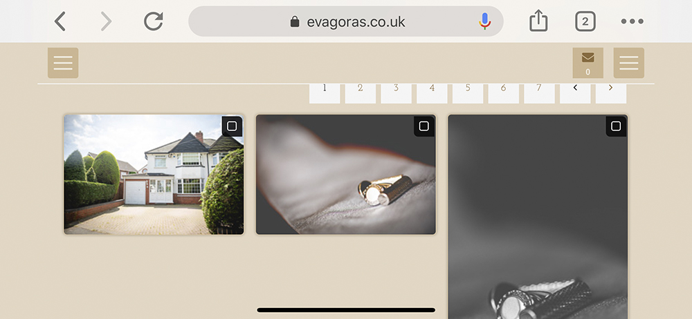
I can't see check boxes on Mobile? Working on Desktop... Any ideas?
I've tried changing the Columns at Screen Breakpoints but this doesn't work.
I've just played around noticed they only appear when rotating mobile to the horizontal.
Mobile Thumbs
Mobile Thumbs (Horizontal)
Mobile Full Screen
Desktop
Offline
#2 2018-11-04 08:56:06
- rod barbee
- Moderator
- From: Port Ludlow, WA USA
- Registered: 2012-09-24
- Posts: 17,830
- Website
Re: CRG: No Check Boxes On Mobile
This is normal in phones. You should see the checkboxes on the large images though.
If you’re not, be sure to provide a link to an album so Matt and Ben will have something to look at.
Are Backlight, all modules, and the Publisher plugin all up to date?
Rod
Just a user with way too much time on his hands.
www.rodbarbee.com
ttg-tips.com, Backlight 2/3 test site
Offline
#3 2018-11-07 18:28:54
Re: CRG: No Check Boxes On Mobile
It would be great to be able to see them on mobiles. Over 60% of my clients use their mobiles for this.
Offline
#4 2018-11-08 13:26:46
Re: CRG: No Check Boxes On Mobile
On mobile, you will see empty checkboxes on large images, and filled checkboxes on thumbnails and in the large view. Images should be selected while navigating the large image presentation.
Offline
#5 2018-11-10 21:14:51
- markharris
- Member
- From: Uppsala, Sweden
- Registered: 2013-01-21
- Posts: 57
- Website
Re: CRG: No Check Boxes On Mobile
It would be great to be able select on the thumbnails on a mobile like we could with CE4. Not just because sometimes it will be easier than having to click on every image, but also because clients will also go 'Huh ? How do I select ?', and we'll have to explain to every client that you have to dig deeper. Any chance of that happening ?
In the example show (http://theturninggate.net/galleries/01- … t-proofing), viewed on an iphone, the thumbnails don't even show an empty heart for the unselected, even though the help box suggests it should. At least showing empty hearts would alert clients that the option to fill them exists somewhere.
Offline
#6 2018-11-11 09:26:27
Re: CRG: No Check Boxes On Mobile
Honestly, probably not going to happen. Cluttering the thumbnails UI on a small display just makes it more difficult to do everything, especially for fat-fingered people, or other who struggle with touch-screens. It's too easy to miss the checkbox and hit the thumbnail instead, or vice versa. The symbols make thumbnails more difficult to see. And no one should be judging images based on mobile-size thumbnails anyway.
If you need to indicate to viewers they should make selections, then include a call-to-action in the gallery description.
Offline
Pages: 1